ACLED
ACLED Trendfinder offers an array of interactive and interconnected tools for tracking political violence and demonstrations around the world. As an extensively customizable hub, it streamlines analysis of emerging trends in a way that can be tailored to the needs of each user, from global researchers monitoring violent hotspots across regions to country analysts looking for granular detail on unrest in a specific subnational area. Identify important changes in political violence and demonstrations across and within countries, situate this activity within historical contexts, and spot early warning signs like the emergence of new conflict actors — all in one place.
Explore ACLED Trendfinder
Country Change Level Map
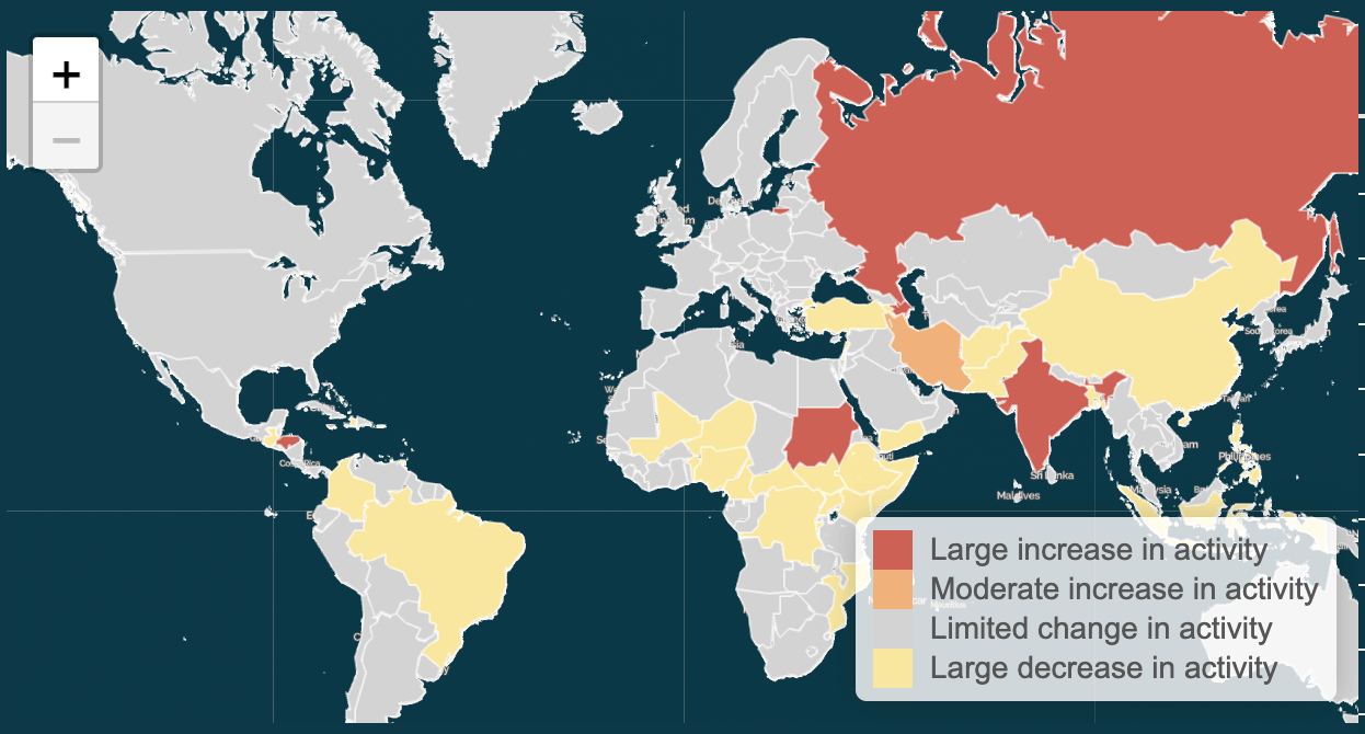
The Country Change Level map identifies countries and territories experiencing a change in political violence and demonstrations in the current week relative to a historical norm. This map is displayed if the “Country” view is selected from the “Map & Table View” menu. If “Previous month” is selected in the menu, the historical norm is the most recent four weeks prior to the current week; if “Previous year” is selected, the historical norm is the most recent 52 weeks prior to the current week.
Change levels are calculated using the number of events given the selected event and/or sub-event types in the sidebar menu. The colors and their corresponding categories and thresholds are as follows:
| Color | Category | Percentage Change Threshold |
|---|---|---|
| Large increase in activity | Greater than a 25% increase | |
| Moderate increase in activity | Between a 10% and 25% increase | |
| Limited change in activity | Between a -25% decrease and a 10% increase | |
| Large decrease in activity | Less than a -25% decrease |
Countries with two events or fewer on average in the previous month/year and five events or fewer in the most recent week of ACLED data are categorized as “Limited change in activity” to account for low baseline activity.
Please note that these maps depict change in violence and demonstration rates, not overall levels. For example, a very violent country that experiences a significant decline in violence may still be very violent, but it will register a “large decrease in violence” on the map.
Event Locations Map
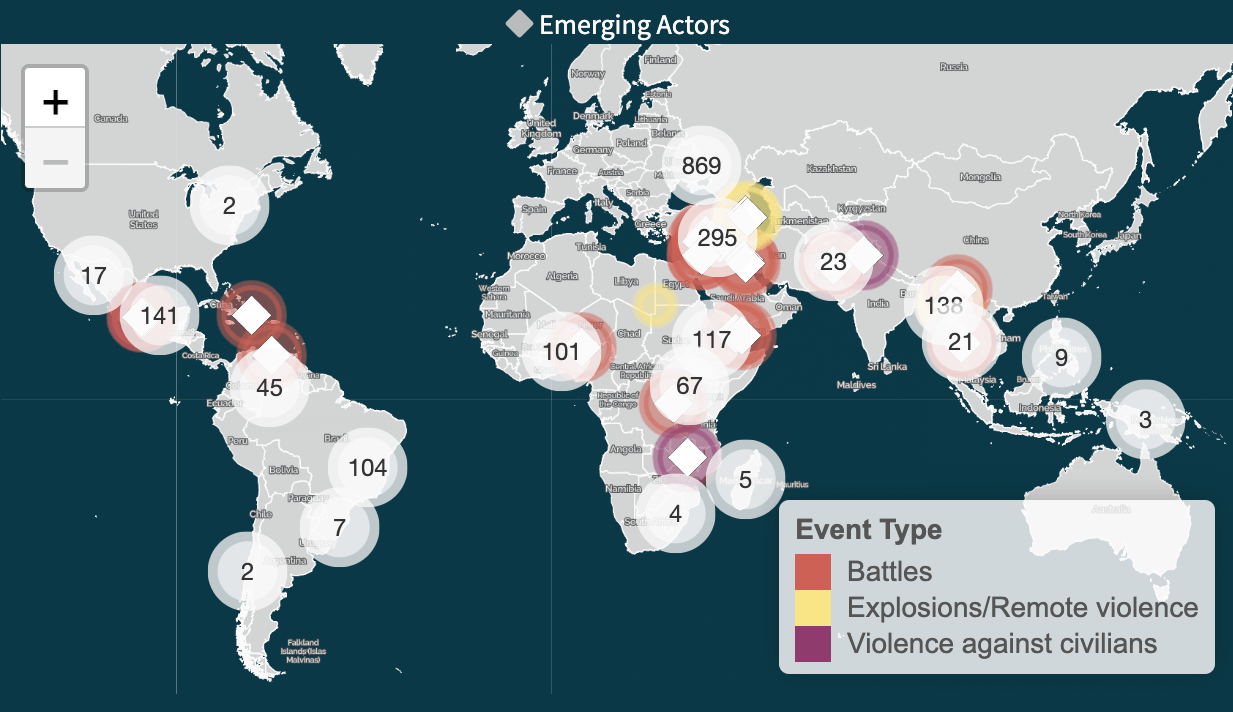
The Event Locations map shows events of the selected event and/or sub-event types for the latest week of ACLED data. This map is displayed if the “Subnational” view is selected from the “Map & Table View” menu. If there are many events near a location, the points will cluster into a single circle with a label denoting the number of events near that location. Clicking a cluster will reveal individual events near that location or additional sub-clusters within the larger cluster. Hovering over the individual points display event information, like the location, date, actors, and event/sub-event types.
Event locations styled with a ◆ indicate that Emerging Actors have been identified. These are actors that were active in the latest week but not within the last year. For easy identification, Emerging Actor events are always shown – they do not cluster with other nearby events on the map like those without Emerging Actors. When hovering over an Emerging Actor event, a ◆ flag will appear next to the actor(s) that are emergent in the event.
The individual points are colored by event type, with the included types selected in the sidebar menu.
Event Count and Change Statistics Table
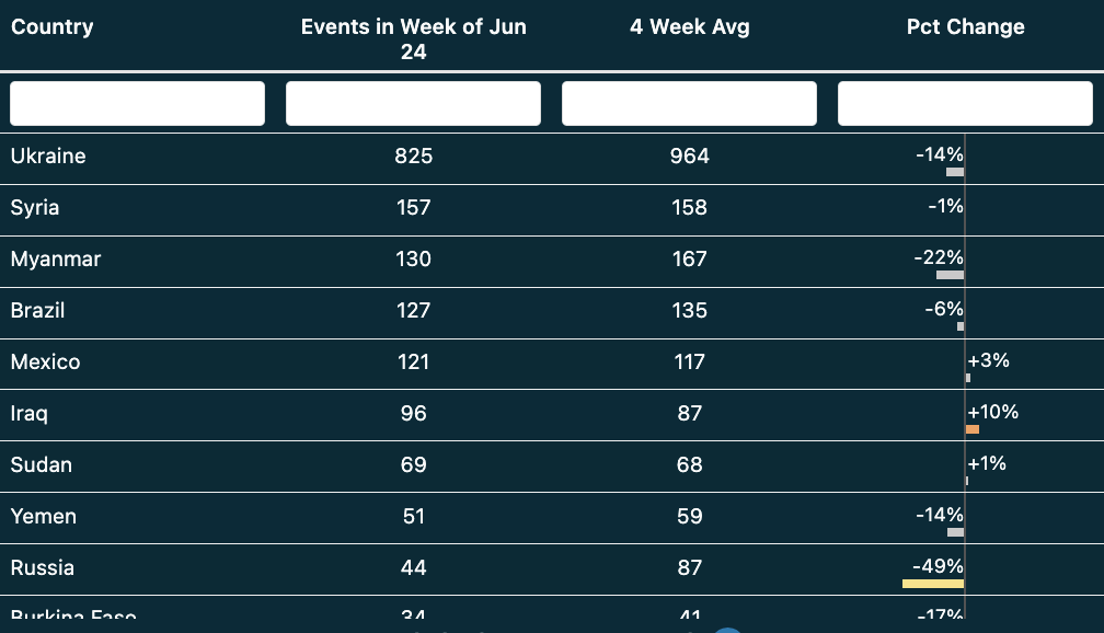
The Event Count and Change Statistics table shows the latest week’s event count for the selected event and/or sub-event types. If the “Country” view is selected from the sidebar menu, the table summarizes activity for each country and territory in the world. If the “Subnational” view is selected, each row in the table is for a single ADMIN1 within a country or territory. If a specific country is selected from the sidebar menu, this table retains only ADMIN1s within that country.
The table displays three statistics for each entry:
| Column Name | Description |
|---|---|
| Weekly Count | Total number of events for each country or ADMIN1 for the latest week of ACLED data. |
| Four-Week Average/Yearly Average | The average number of events for a corresponding country or ADMIN1 over the most recent four weeks (if “Previous month” is selected) or 52 weeks (if “Previous year” is selected). |
| Pct Change | The relative difference between the most recent week’s event total compared to the selected average, expressed in percentage terms. The colors correspond to the change levels categories. |
The table is interactive, with complete sorting and filtering capabilities. Click a column header to sort by that column. To search for a specific country or ADMIN1, type into the bars under those headers. The bars under the statistic column headers may be used to filter values, retaining only rows with greater than/equal to the specified value. Clicking a specific country or ADMIN1 will select that unit in the sidebar menu, updating the other elements of the dashboard to reference only that selection. To export the contents of the table to a spreadsheet, click the “Download” button.
The colors for the “Pct Change” column correspond to the following thresholds:
| Color | Category | Percentage Change Threshold |
|---|---|---|
| Large increase in activity | Greater than a 25% increase | |
| Moderate increase in activity | Between a 10% and 25% increase | |
| Limited change in activity | Between a -25% decrease and a 10% increase | |
| Large decrease in activity | Less than a -25% decrease |
To adjust for low baseline activity levels when calculating percentage changes, countries with two events or fewer on average and five events or fewer in the most recent week of ACLED data are categorized as “Limited change in activity.” ADMIN1 units with one event or fewer on average and three events or fewer in the most recent week of ACLED data are similarly categorized as “Limited change in activity.”
| Applies to… | Average events in previous month/year | Event count from most recent week of ACLED data | Category |
|---|---|---|---|
| Countries | 2 events or fewer | 5 events or fewer | Limited change in activity |
| ADMIN1s | 1 event or fewer | 2-3 events | Limited change in activity |
Trends Chart
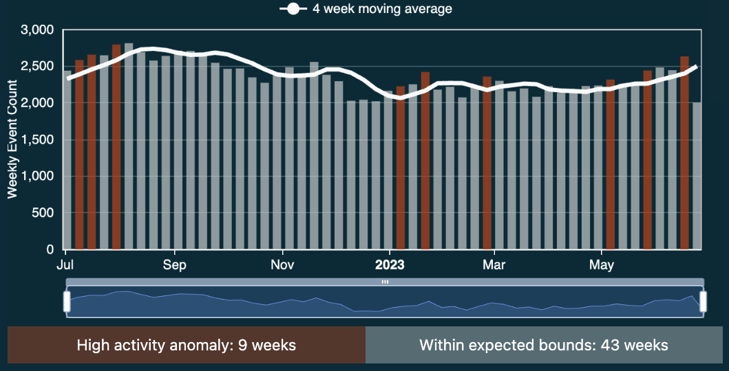
The Trends chart shows events per week over the last year, situating current activity within the historical context. When “All” countries and territories are selected, the chart shows the total number of events per week across the world. If an entire country is selected, the event total is for the entire country. If a specific ADMIN1 is selected, the event total is just for that ADMIN1.
Each bar represents the event count for a given week over the past year. Weeks are shown based on ACLED coding weeks, which begin on Saturday and end on the following Friday. The trendline shows the moving average event count, looking back to the last four weeks (if “Previous month” is selected) or the last 52 weeks (if “Previous year” is selected). The four-week average is useful for understanding how current activity relates to the short-term norm, while the yearly moving average is better suited for comparing to a longer-term norm.
Weekly event counts are flagged as “High Activity Anomalies” if they are two or more standard deviations above the moving average. The total number of high activity weeks during the past year is annotated below the chart.