Sessions at the Tableau Conference (#TC18) presented ideas around new data visualization schemes to portray trends and patterns in novel ways. The dashboards below highlight a few of these data visualization ideas using ACLED data from across regions.
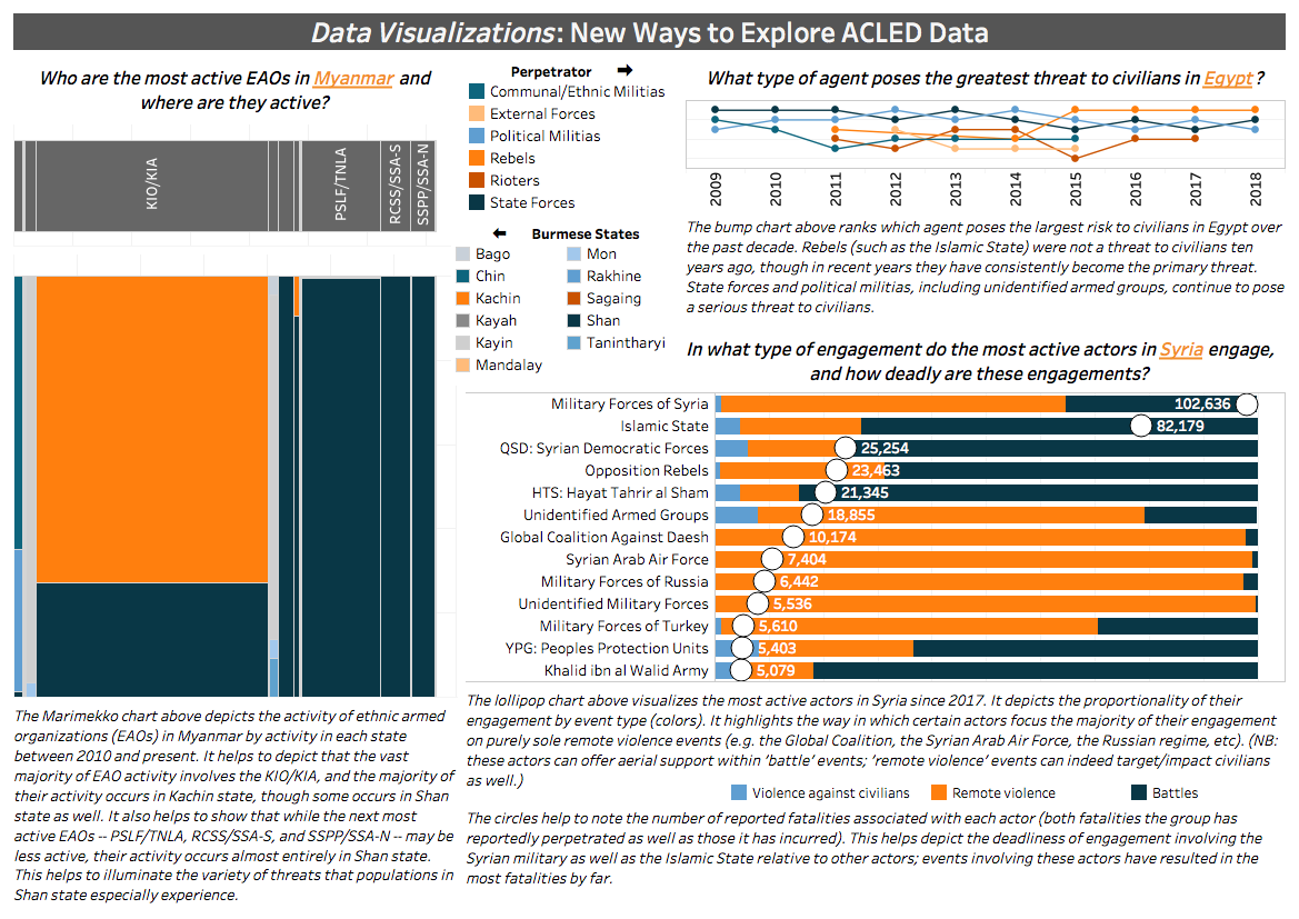
The Marimekko chart allows for comparing the proportion of EAO violent engagement while also understanding where it is occurring. Here, the activity of ethnic armed organizations (EAOs) in Myanmar since 2010 is visualized, highlighting where their activity occurs. The KIO/KIA engage in the majority of political violence relative to other EAOs, and the majority of their activity occurs in Kachin state. However, it is important to also understand the variety of threats that populations in Shan state experience given the proportions of violence by a variety of EAOs in that state.
The bump chart allows for understanding changes in ranking over time. Here, agents of violence in Egypt are ranked by who poses the largest risk to civilians over the past decade. The rise in rankings of rebels (especially the Islamic State), for example, is evident as they were not a threat to civilians ten years ago, though in recent years have consistently become the primary threat.
The lollipop chart allows for visualizing an additional measure on the bar chart. Here, the most active actors in Syria since 2017 are visualized, helping to highlight how certain actors focus the majority of their engagement on purely sole remote violence events while also highlighting the deadliness of engagement involving the Syrian military as well as the Islamic State relative to other actors by far.
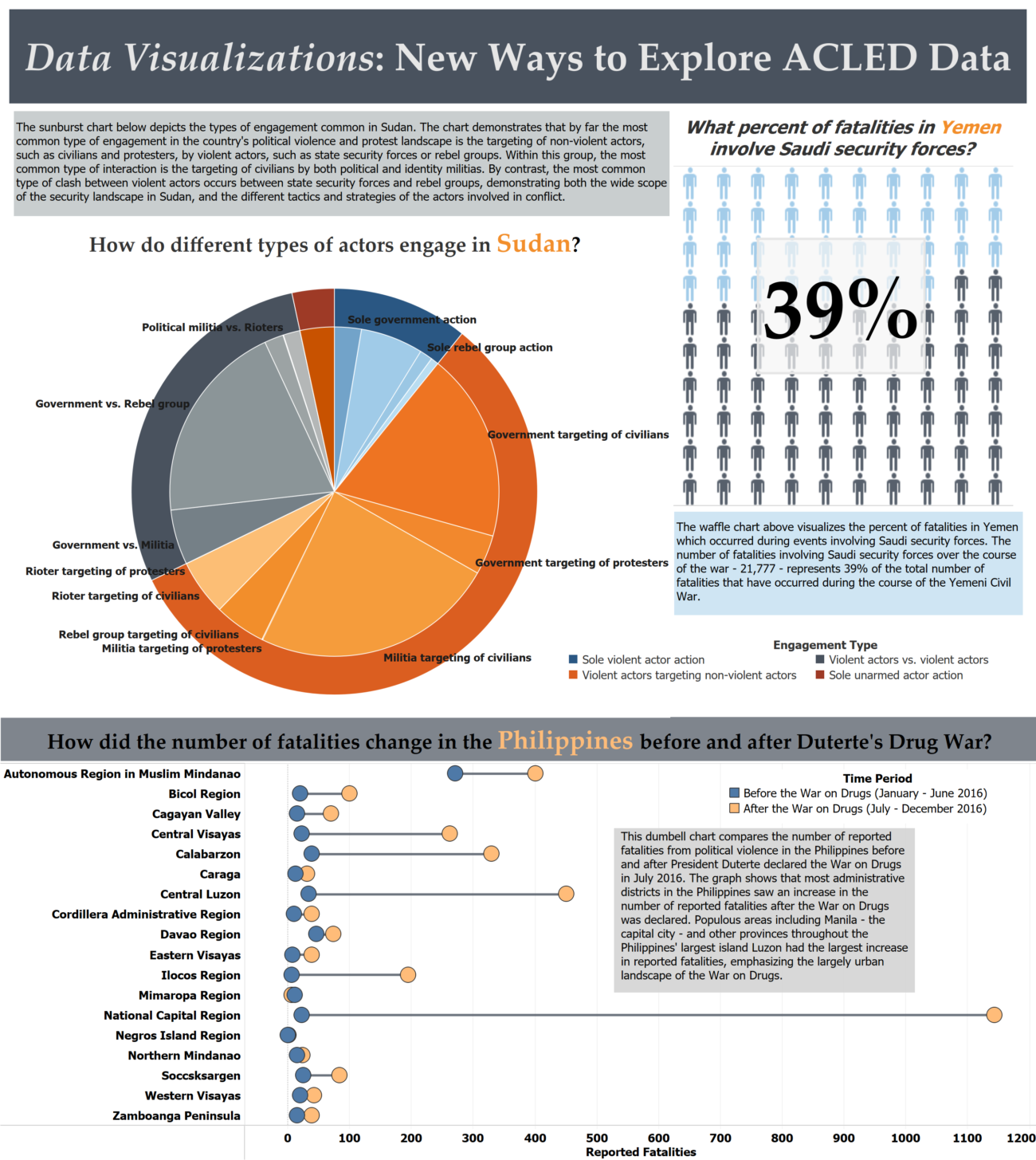
The waffle chart allows for understanding how parts contribute to a whole. Here, each icon represents one percent of the total reported fatalities that have occurred over the course of the Yemeni Civil War. Those colored pale blue represent those involving Saudi security forces. The chart provides a stark visualization of the high level of involvement of Saudi Arabia in the political violence landscape of Yemen.
The sunburst chart allows for understanding multiple levels of categories and how they contribute to percent of a total within a hierarchy. Here, the wider categorizations show what types of engagements are most common in Sudan, while the nested categories visualize the actors engaged in these interactions. The sheer variety, and especially the differences across rebel group and political militia activity patterns (respectively, mostly fighting with other armed groups, versus targeting civilians) demonstrate the diversity of the political violence landscape.
The dumbell chart allows for displaying change between two points, especially two points in time. Here, the blue dots represent reported fatalities per province in the Philippines before the declaration of the War on Drugs in 2016, while the yellow dots represent the reported fatalities after the War on Drugs commenced. The graph demonstrates a stark difference in how the War on Drugs has affected reported fatality levels across different provinces; those that are more urban and populous, such as those on Luzon and in particular surrounding the capital, saw the largest increase in reported fatalities after the War on Drugs began.


